Selecting the right font is a crucial aspect of website design, particularly when considering accessibility for individuals with dyslexia. Dyslexia is a common learning difference that can significantly affect a person’s ability to read and decode text. Traditional typefaces often exacerbate these reading challenges, as letters may appear similar and can be easily confused. Consequently, choosing dyslexia-friendly fonts can greatly enhance readability and improve the user experience for people with dyslexia.
Dyslexia-friendly fonts are specifically designed to eliminate issues that make reading more difficult for those with dyslexia. These typefaces typically feature heavier bottom portions to reduce letter flipping, increased spacing between letters and words, and distinct letter shapes that prevent confusion between characters like ‘b’ and ‘d.’ By applying such fonts on websites, designers can create an inclusive digital environment that accommodates the needs of all visitors, including those with dyslexia. Font size is also important, as is that text is properly spaced.
Incorporating these specialized typefaces into web design does not only benefit those with dyslexia, but it also improves overall legibility and can lead to a more pleasant reading experience for a wider audience. This approach aligns with the broader principles of universal design, ensuring that the content is accessible to as many people as possible, including those who have not been formally diagnosed with dyslexia but may still struggle with traditional fonts.

Understanding Dyslexia
Designing with accessibility in mind is vital for many people to enjoy and use the internet, including those with Dyslexia. It is a common learning difficulty that primarily affects reading and writing skills. It is characterized by difficulties with accurate and/or fluent word recognition, poor spelling, and decoding abilities. Importantly, dyslexia is unrelated to intelligence, and those with dyslexia have normal vision and intelligence. The challenges of dyslexia are often due to a deficit in the phonological component of language, which is unexpected about other cognitive abilities.
Research suggests that certain fonts can ameliorate reading challenges for individuals with dyslexia. These dyslexia-friendly fonts are designed with unique features that aim to reduce the common issues dyslexic readers face, such as letter swapping, mirroring, and blending.
Characteristics of dyslexia-friendly fonts include:
- The heavier bottom portion of letters, helps to indicate direction.
- Wider letter spacing to reduce crowding.
- Distinct letter shapes prevent confusion between similar-looking letters such as ‘b’ and ‘d’.
There is scientific evidence that supports the use of dyslexia-friendly fonts. Studies indicate that these specialized typefaces can improve readability and reduce reading errors. However, it is crucial to recognize that their effectiveness can vary from person to person. They are, therefore, one of many tools available to support individuals with dyslexia.
Despite the support dyslexia-friendly fonts may offer, it is essential to remember that they are not a cure for dyslexia. They serve as an aid to make the reading process more accessible and are most effective when used in conjunction with other educational strategies and accommodations.
Characteristics of Dyslexia-Friendly Fonts
Selecting fonts for readers with dyslexia involves prioritizing legibility, simplicity, and appropriate spacing. These characteristics reduce visual confusion and enhance the reading experience.
Legibility
Fonts suitable for dyslexic readers often feature a unique design for each letter, which reduces the likelihood of confusion between characters. Key aspects include:
- Heavy Bottoms: This aspect helps guide the reader’s eye along the line of text.
- Distinctive Shapes: Letters should have distinct shapes to prevent confusion between commonly mistyped letters like “b” and “d.”

Simplicity
The overall simplicity of the typeface is crucial as it aids in clear character recognition. Notable features are:
- Sans-serif: Such fonts often lack the small projecting features called “serifs” at the end of strokes, making them cleaner and easier to discern.
- Unadorned Strokes: Fonts without flourishes or embellishments facilitate better character identification.
Spacing
Proper spacing can greatly affect readability for individuals with dyslexia. Spacing considerations include:
- Letter Spacing: Adequate space between letters (kerning) helps prevent visual crowding.
- Word Spacing: Sufficient space between words supports quick visual recognition of word boundaries.
Overall, these attributes are essential for enhancing readability for users with dyslexia and should be carefully considered when choosing a font for any text-heavy interface.
Top Dyslexia-Friendly Fonts
Selecting the right fonts can significantly enhance readability for individuals with dyslexia. A blend of academic research and user feedback suggests certain typeface characteristics improve legibility. Below are fonts recognized for their dyslexia-friendly features.
OpenDyslexic

This font includes weighted bottoms to help indicate direction. Users have reported that this unique feature prevents the letters from appearing to jumble or flip.
Comic Sans

Often criticized for its informal look, Comic Sans proves to be highly accessible. The irregular shapes of its characters prevent confusion between letters that look similar.
Arial

A go-to sans-serif font that is clean and evenly spaced. Its simplicity and familiarity promote ease of reading.
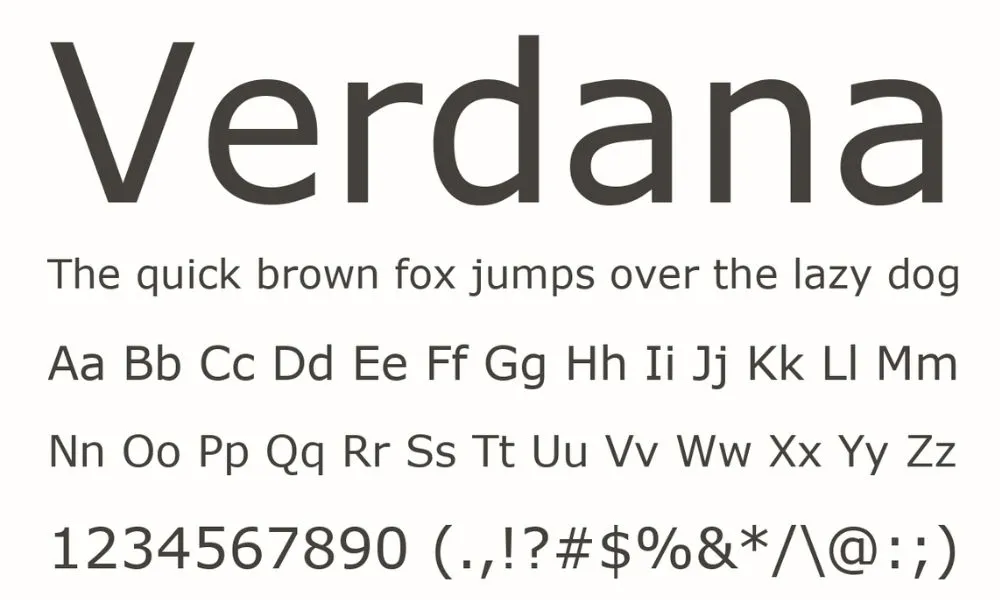
Verdana

Another sans-serif font characterized by wide spacing and clear, simple shapes. Verdana’s letters are designed to be distinct from one another, reducing the likelihood of misreading.
Trebuchet MS

This font presents a strong visual contrast between letters due to its broad, easy-to-distinguish characters.
A summary of the recommended fonts and their defining features is provided below for quick reference:
| Font | Features |
| OpenDyslexic | Weighted bottoms, unique letter shapes |
| Comic Sans | Irregular character shapes, distinct letterforms |
| Arial | Clean, evenly spaced, sans-serif |
| Verdana | Wide spacing, clear simplicity, sans-serif |
| Trebuchet MS | Strong visual contrast, broad characters |
These fonts are widely supported across various platforms, making them an ideal choice for website text to accommodate readers with dyslexia. Designers are encouraged to consider these options to foster inclusive digital environments.
Integrating Dyslexia-Friendly Fonts in Digital Platforms
What is language accessibility? Essentially, utilizing dyslexia-friendly fonts on websites and digital platforms enhances readability for individuals with dyslexia. By following specific guidelines, designers and developers can improve user experience significantly.
Guidelines for Websites
When implementing dyslexia-friendly fonts on websites, consider the following points:
- Font Choice: Opt for fonts like OpenDyslexic, Lexie Readable, or Comic Sans, known for their weighted bottoms, which help indicate direction.
- Font Size: Use a larger font size, generally 12-14 pt for body text, as it can help in distinguishing individual letters.
- Line Spacing: Incorporate 1.5 spacing between lines. This white space prevents crowding and makes text more approachable.
- Character Spacing: Increase character spacing by at least 0.12 times the font size to improve character recognition.
- Short Paragraphs: Write paragraphs that are concise; aim for a maximum of three sentences to facilitate easier scanning of text.
- Alignment: Left-aligned text is preferable over justified text, as it creates a uniform beginning edge and reduces visual confusion.
To apply these fonts effectively:
- CSS: Utilize Cascading Style Sheets (CSS) to define font properties universally across the website.
body {
font-family: ‘OpenDyslexic’, Arial, sans-serif;
font-size: 14pt;
line-height: 1.5;
letter-spacing: 0.12em;
text-align: left;
}
- Responsiveness: Ensure font adjustments are responsive and maintain readability across all devices.
- Testing: Regularly test the website with dyslexic users to identify areas for improvement.
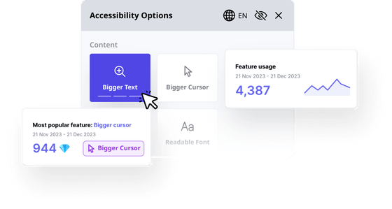
- Accessibility Options: Include a menu that allows users to switch between standard and dyslexia-friendly fonts.
Accessibility Tools and Resources
When individuals with dyslexia navigate the web, an accessibility app is a key component in providing an inclusive experience. Accessiblyapp.com is such a resource that caters to people with reading difficulties through various supportive features.
One primary feature of Accessiblyapp.com is its offering of dyslexia-friendly fonts. These typefaces are designed to mitigate common reading errors associated with dyslexia, such as letter mirroring. They often have heavy baselines, non-symmetrical letters, and ample spacing. By incorporating these fonts, websites can greatly enhance readability for users with dyslexia.
In addition to specialized fonts, Accessiblyapp.com also provides:
- Text-to-speech (TTS): This allows users to listen to the written content, aiding comprehension and reducing reading strain.
- Contrast adjustments: Users can alter text and background contrast to reduce visual stress.
- Keyboard navigation: This ensures that users who find it difficult to use a mouse can still navigate the website with ease.
| Feature | Description |
| Dyslexia-friendly fonts | Fonts with weighted bottoms and unique letter shapes. |
| TTS | An audio version of written text. |
| Contrast adjustments | Customizable text and background colors for better visibility. |
| Keyboard navigation | Full website navigation using keyboard keys. |
Web developers and content creators are encouraged to utilize tools like these to foster an accessible digital environment for everyone. By embracing such features, companies demonstrate a commitment to inclusivity and a clear understanding of diverse user needs.


