What is User Accessibility for the Color Blind?
User accessibility for the colorblind entails designing elements of your website to allow people who can’t distinguish the entire color spectrum. This type of accessibility for the visually impaired enables them to use and experience your website as intended. Color blindness accessibility addresses factors like text and background color. It also considers the text’s size, saturation, texture, and patterns.
Is Color Blindness a Disability?
Color blindness can be considered a disability according to the Americans with Disabilities Act (ADA), which describes disabilities as “any condition that significantly limits one or more major life activities”. Color blindness is a condition where individuals have difficulty distinguishing certain colors due to inadequate color contrast. It is also known as color vision deficiency.
The classification of color blindness as a disability varies based on its severity and its impact on daily activities. Other traditionally recognized disabilities under the ADA include mobility impairments (such as paraplegia and multiple sclerosis), blindness or low vision, and deafness, among others.
While color blindness affects the visual presentation of content and requires considerations like color blind accessibility and a carefully designed color palette, it also involves tools like screen readers to aid those with color vision deficiencies. In normal vision, color distinctions are clear, but for those with color blindness, these distinctions are not as apparent, necessitating inclusive design practices.
Not to mention, color blindness might affect the career you choose, especially for creative fields requiring color perception, such as digital art, plumbing, and electrical work.
In short, if color blindness substantially impacts your daily activities, it may be classified as a disability. For example, if you have difficulty interpreting color-coded maps in subway stations or struggle with educational materials like PowerPoint presentations, these disruptions in daily life could qualify as a disability.
If you would like to test yourself for color vision deficiency, visit Enchroma – Color Blind Test.
What Are Web Content Accessibility Guidelines?
Web Content Accessibility Guidelines (WCAG) check contrast and color. They standardize a rubric for color definitions and allowable contrast ratios by text size, to name a few. The WCAG guidelines apply to many types of content on a website, from the words on the screen to how text color changes when hovered over. In addition, the guidelines help users navigate the web and help with outlining forms, checkboxes, and even graphical elements like logos and icons.

How Do You Accommodate Color Blindness?
Technology has played a significant role in the advancement of colorblind-friendly UX. Accessibly’s features help your web pages progress towards a whole user-accessible experience. Here are a few ways we can do our part to accommodate color blindness:
Basic is best for color blindness
When developing a website, you should limit your color palette. The more colors you have in your design, the more chances there will be for potential confusion. A minimal design is not only applicable when you are designing for color accessibility, but it is aesthetically pleasing as well. Too many colors can start to get confusing for people with color blindness. Keeping the colors essential will help maximize the viewability.

Use different textures and patterns for better contrast
For elements that require emphasis, try using textures instead of multiple colors. For instance, graphs and charts might complicate things for color-blind users. In such a situation, it’s wiser to use color-contrasting patterns. The depth of contrast ratio helps users with certain types of color blindness see things more clearly.
Use both colors and symbols to beat color blindness.
It would be best not to rely on a palette of color alone to deliver a message. Think of a stop sign. The red signals us to stop, but what if we couldn’t see the color red in that stop sign? The shape and context of a stop sign distinguish it from other signs and make its intention known. This specific shape sets it apart from a sign telling you to yield. Aside from helping with color-blind issues, this helps to minimize confusion.
Be careful with contrasting colors and hues for people dealing with red-green or blue-yellow color blindness.
Black and white are suitable for contrast, but so are colors. Using various contrasting colors and hues in your design can make it viewable by people with or without color-blind deficiencies. By playing with the brightness and saturation of the colors, you can adjust how others see the content. These little tweaks allow better viewability.
Avoid non-compatible color combinations.
You need to be wise when picking out the color combinations you want for your site. Color blindness affects people in different ways, so determining which color combos are suitable to use in web design can be challenging. For example, people dealing with red-green color blindness would have a different color vision deficiency than someone with blue-yellow color blindness.
The following are a few color combinations you will want to avoid since they might end up being a nightmare for color-blind people:
- Red and Green
- Brown and Green
- Purple and Blue
- Blue and Green
- Yellow and Light Green
- Grey and Blue
- Grey and Green
- Black and Green
If you cannot avoid the color combinations listed above, try varying the shades of the colors.
What Colors Are Color-Blind Accessible?
There are roughly 300 million color-blind people across the world. Men are affected more by color blindness than women overall, but nobody is immune to the possibility of losing the ability to differentiate colors properly.When creating a color-blind-friendly palette, you want to make the base using two primary hues: blue and red. Orange and yellow will work also. The rest of the palette colors should originate from these two hues. You can make any palette variation by adjusting the attributes of your colors.

Colors to Avoid for Colorblind Users on Your Web Page
You want to avoid combining red and green, as this is particularly difficult for those with red-green color blindness. Roughly 5% of people cannot distinguish between red and green. It is a good idea to avoid red and black combinations. People who cannot detect red will confuse red and black, so the item will not be legible.
What Are the Different Types of Color Blindness?
There are different types of color blindness, each with a specific impairment. To better understand accessibility, you need to have an understanding of the different types of color blindness and how each affects a person’s eyesight:
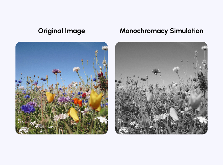
Monochromacy

Monochromacy is a condition where colors do not register for a person. They only see black, white, and shades of grey. Monochromacy is a broad term that accounts for two conditions.
Achromatopsia (rod monochromacy) is a condition where someone will not see color due to missing or inert retinal cones. It is a rare condition often accompanied by light sensitivity or near/far-sightedness. The second condition is called cone monochromacy. With cone monochromacy, people have generally normal vision despite the lack of ability to see color.
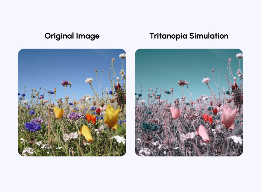
Tritanopia

Tritanopia is impaired blue and yellow vision. It is a condition where people cannot distinguish between blues and yellows. People with tritanopia have regular red and green eyesight. It is estimated that one percent of males and females have tritanopia. Most people with tritanopia do not have any other issues with their vision.
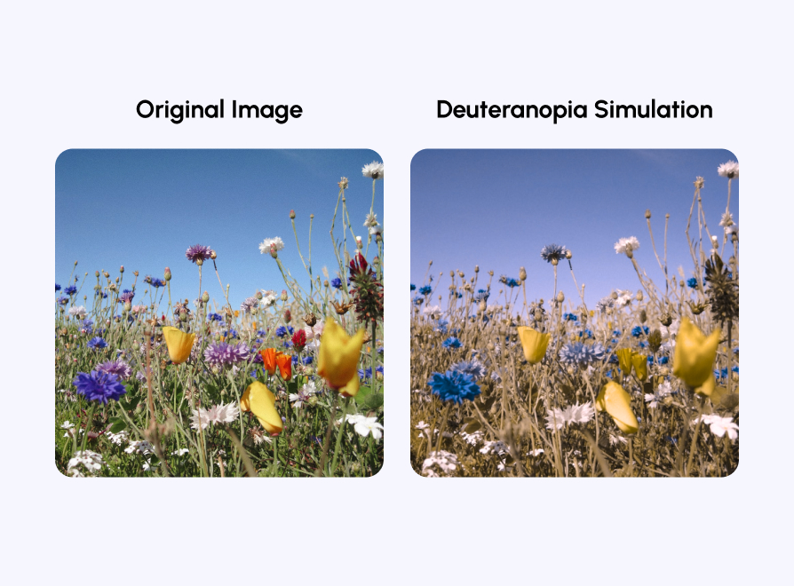
Deuteranopia

Deuteranopia is a type of color blindness where people can’t fully identify green colors. People dealing with it can exhibit nearly complete blindness to green. It’s estimated that about 1% of the male population suffers from deuteranopia while less than half a percent of women are affected.
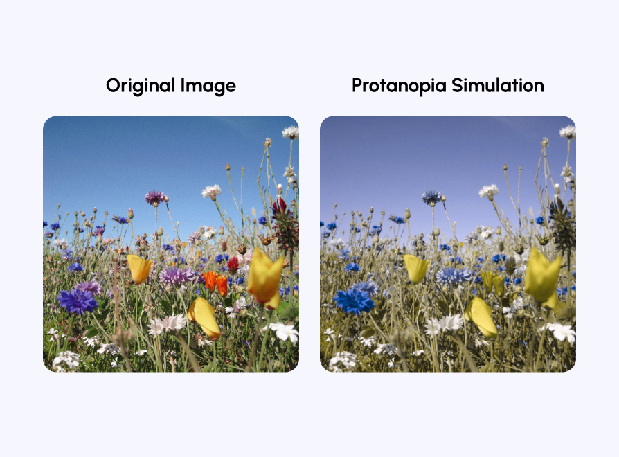
Protanopia

Protanopia is a condition where people can’t distinguish red hues due to a lack of red cones, and it’s the other subtype of red-green color blindness. Again, about 1% of the male population suffers from this condition. Women are rarely affected by this type of color blindness, but it is not impossible.
What Colors Should You Use to Boost Accessibility?
Now that you know what colors to avoid, let’s consider what colors are good when maintaining color blindness accessibility. Accessible colors are color combinations with enough contrast to make layered elements like icons distinguishable to those who are visually impaired or have poor color vision.
A key component of accessibility is that colors convey how people with disabilities understand information. The outcome ensures all page components are inclusive, accessible, and legible.
For the color-blind community, the ability to tell certain hues apart depends on the color contrast ratio. This ratio refers to the amount of contrast between two layered objects, such as background colors against foreground ones.
Is Color Blindness Covered Under the ADA?
In the United States, colorblindness is considered a disability under the Americans with Disabilities Act (ADA). This means you are required to provide reasonable arrangements for users who are color-blind. There are penalties for websites that do not comply with the ADA.
Users may not fully understand the level of accessibility because most of the inner workings are undetected; however, they are entitled to full access to information just as much as the next person. The fact that color blindness is covered under the ADA is why people with disabilities are able to surf the internet without issue.
What Colors Are Accessible For the Color Blind?
The best colors to use for color-blind eyes will vary. Contrasting colors generally work best for users who are color-blind. Bright colors work well, too. People with color deficiencies do not have an issue seeing the colors. The problem is telling them apart.
White and Black
White and black are on opposite ends of the color spectrum, so they work well together. Since you should never rely on color, a solid practice would be creating the website in grayscale. The contrast between colors and the background brings another issue. Color-blind people are not as sensitive to colors on the ends of the spectrum, so reds and blues often seem darker to the color-blind user.
Links
Remember that any link should be highlighted by color and underlined to ensure there is no confusion. Even when they cannot see the colors on the page, the treatment and underlining will allow visitors with color blindness to recognize where there are links.
Maps
People with color blindness also have issues when dealing with maps. Image maps usually have portions of it that are clickable. However, different colors often mark those areas. To counter this, add underlined text to the clickable areas. An outline around the map is another way to make it stand out within the text.
How Do I Comply With the ADA Website Accessibility Guidelines For the Color Blind?
It is based on a spectrum scale. Based on how much a site meets the WCAG guidelines, the site can be more compliant or less compliant. The risk of a business being sued depends on how compliant a site is. The more compliant a website is, the less chance it will be sued.
Keep Accessibility In Mind for Color Blind People Across the Globe
By following the guidelines, you reduce the chances of backlash for a site that is not in compliance. In addition, these measures will ensure that you will rank better than a page that does not.
Accessibly is an excellent solution for accessibility and complying with most color blindness accessibility guidelines. By ensuring your website follows these guidelines, you address the needs of people with color blindness and those with other visual impairments. Implementing proper color contrast and an inclusive color scheme enhances the visual elements of your site, making it more user-friendly for everyone. Accessible design is crucial, as it ensures that all users can interact with your site effectively. When you have made all the necessary corrections to your setup, you remove the worry of unnecessary burdens due to not correctly setting up your website. Of course, keep up with the maintenance to benefit the performance of your website continually.


