In the world of user experience, one of the main factors that can make or break your experience is font readability. It shapes the entire perception of UI across platforms, from a simple WordPress website to a full-fledged commerce store. Even a single shift in a font can affect user engagement, brand perception, and bounce rates, which are other key performance indicators websites rely on.
Keep reading to learn more about the impact of font readability on user experience, including our favorite fonts, best practices on color choices, and how innovative widgets like Accessibly can help you optimize font and color accessibility.

The Impact of Font Readability on User Experience
There are several ways font readability can impact a website user experience:
- Engagement: Readability is the number one factor impacting user experiences. For example, traditional fonts like Times New Roman are not suited for community pages, full websites, or similar content, as they do not match the overall tone. In turn, playful fonts like Comic Sans go a long way toward invoking a cheerful tone.
- Accessibility: Unsurprisingly, there are actual fonts designed for readability. The best fonts for dyslexia are Dyslexie or OpenDyslexic, which eliminate many inconsistent letter shapes and other odd elements that can stump them from time to time.
- Branding: When it comes to branding, readability is key. One brand can have different fonts or a font choice depending on the medium. For example, traditional yet modern sans-serif fonts can work wonders for product pages, whereas cursive fonts can invoke a lot of creativity and reinforce the brand’s identity. Consistently use brand-appropriate fonts throughout your website for a unified look.
- Improved Mobile UI: Don’t forget about your mobile UI. By selecting the correct font size and font types for individuals with disabilities, it’ll help maximize your mobile browsing experience. Remember lightweight font files? In mobile environments that often suffer from a lack of bandwidth, they are much better. Every little step to improve font readability counts!
Another way selecting the correct font could impact your user experience is by increasing your time on the page and lowering bounce rates. It can even improve CTA performance, where you can see conversion rates skyrocket.
Remember, with approximately 15% of the world suffering from a full or partial disability, choosing the correct fonts for your website can go a long way toward boosting your website and business performance.
The Significance of Color Choice for Accessibility
Another critical aspect of accessibility is the color choices on websites, mobile applications, and similar platforms. The right color choice improves visibility for all users, including non-disabled and disabled persons.
According to the Web Content Accessibility Guidelines (WCAG), there are guidelines in place for websites to meet specific requirements. One is color contrast guidelines where high contrast between text and background colors is offered to improve readability. WCAG and ADA compliance widgets like Accessibly do an exceptional job matching users with preferred text and background high-contrast color options.
Another reason for color choice for accessibility is to accommodate color-blind users. According to EnChroma, a glasses retailer, it’s estimated that there are close to 3 million color-blind people worldwide, with one in 12 men color-blind versus one in 200 women.

How to Choose the Best Colors
When it comes to the best colors for colorblind accessibility, there are many ways to find out.
As a starting point, always choose color combinations with a stark contrast between the background and text. It makes no sense to apply red lettering to a pink background, for example.
Secondly, there are tools called Color Contrast Checkers, allowing web developers/designers to run quick contrast checks to ensure accessibility. Some highly recommended tools are Accessible Color Palette Builder or Contrast Ratio, along with various browser extensions like ColorZilla. Both work by simply typing in a base color that you want, which returns a chosen color palette and several other variations based on efficiencies, along with the option to customize your color palettes.
One of the best things about these tools is their adjustable settings based on color vision deficiencies. For example, if an individual suffers from deuteranopia (green blindness), they can choose specific “optimal” color palettes, as well as brightness levels. Pretty cool!
Of course, these tools adhere to best practices and would never combine problematic color combos such as blue and yellow. Remember, it’s all about high contrast between text and background imagery.
Lastly, take into account the importance of emotional impact. When evoking happiness, sadness, and other reactions, psychology allows you to pick the right primary, secondary, and tertiary ADA-compliant colors to create a long-lasting and memorable brand.
What Font Is Easy On The Eyes?
Do you constantly glare and squint at your computer screen? Your website or mobile application likely does not meet accessibility standards.
Here are our favorite tips for selecting san serif fonts, serif fonts, or others that are best on the eyes:
Readability Over Design
Prioritize readability over decorative and cursive elements. Fonts that adhere to principles such as spacing, consistent stroke width, and other best practices are more likely to keep your visitors on the website. Don’t forget to adjust font size and weight, as small fonts cause eye strain and perplex visually impaired users.
Watch Out for Contrast

Choosing color contrast is one of the most essential elements of selecting easy-on-the-eye fonts. Make sure you offer options for visually impaired people to adjust font and background colors so that the content they’re looking for pops out more clearly on the page. Don’t forget your blue light computer screen for eye protection!
WCAG and More WCAG
A popular choice is to use manual or automated tools to identify any shortcomings with your accessibility. Scan your site and identify issues immediately in adherence to the Web Content Accessibility Guidelines (WCAG).
Serif vs. Sans Serif Font
When selecting serif or sans serif fonts that are great on the eyes, consider Serif font and Sans Serif font. They do not have small decorative strokes at the end of various characters, which may stump dyslexics from time to time. However, both serif fonts and sans serif fonts give you many readable options to choose from. Whatever the case, never settle for script and decorative fonts over serif fonts or san serif fonts for the majority of your web content.
Test for Accessibility
Don’t forget to test accessibility on fonts, which are already on your site. Are you already meeting the web content accessibility guidelines with your chosen fonts? Are proper line lengths being met? If you want to optimize your website content to meet the needs of those with visual impairments or dyslexia, it may be time to switch to another font like sans serif or serif fonts.

Don’t Ignore Font Size
Remember to consider text sizes/minimum font size for accessibility. Even a slight bump below the minimum can affect readability, so we encourage you to choose fonts with ample thickness to ensure they can be easily viewed against a white background or dark background, regardless of color.
Consider Language Barriers
Internationally, don’t assume all of your website visitors live in the continental US. It’s essential to prioritize language accessibility and internationalization, which means that your website should be compatible with fonts that support languages and characters belonging to specific regions like China, India, and the Netherlands. Of course, some sans serif fonts will not work in those regions.
One of the best ways to overcome this is by using “web-safe” fonts (those that the majority of users have), like Times New Roman, Arial, and Helvetica (our top three favorites!).
Any of the above guidelines will go a long way toward web accessibility for the visually impaired.
A Word on Accessibly
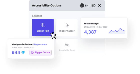
When it comes to preferable fonts, color choices, and more for the visually impaired who visit your website, the Accessibly Accessibility widget is ready to help. It has a long list of features for improving web legibility, allowing website visitors to adjust the specifically designed UI as they see fit, keeping some WCAG and ADA guidelines in mind.
Some features available on the Accessibly widget include legibility features e.g. larger text and larger cursors, more reading lines, hidden images, alternative image text, and inverted colors. It even allows you to select high-contrast background and text colors, which are necessary for visually impaired users to better discern content.
Still on the fence? Enjoy a free 7-day trial today and see for yourself!
Accessibly supports the following platforms: Shopify, Squarespace, Weebly, Wix, BigCommerce, Joomla, WordPress, Magento, Elementor, WooCommerce, Drupal, Webflow, and Duda. It can also be implemented into any website as a standalone app via custom code.


