One of the most important things you can do to amplify user experiences is to follow inclusive web design principles. The goal is to create accessible and usable websites and mobile applications for as many people as possible, not just individuals with disabilities.
Keep reading to learn about inclusive web design with a focus on what it means, underlying principles, the benefits of implementing inclusive web design practices, and our favorite tips for incorporating inclusive web design principles into your daily life.

What is Inclusive Web Design?
Inclusive web design means designing web pages with an accessibility focus that accommodates a wide range of visually, cognitively, mobility, and audibly impaired users, as well as the non-disabled. It aims to break barriers across cultures, languages, and abilities in accessing brick-and-mortar locations or websites/mobile applications.
Note that inclusive web design is not the same as accessible design, as accessible design focuses on individuals with disabilities only, whereas inclusive web design seeks to accommodate the needs and preferences of all users.
One of the best ways to understand inclusive web design is by diving deep into its seven principles: Equitable Use, Flexibility in Use, Simple and Intuitive Use, Perceptible Information, Tolerance for Error, Low Physical Effort, and Size and Space for Approach and Use.
Equitable Use
Equitable Use is a design theory that ensures goods and services are available to everyone, regardless of their disabilities. Equitable Use means equipping websites with UI upgrades to recognize the needs of the visually, cognitively, mobility, and auditorily impaired, such as compatibility with assisted devices like screen readers, alternative text for images, and a stronger emphasis on focus management that relies on keyboard shortcuts instead of website navigation elements for the mobility impaired.
One excellent example of equitable use is airport check-in kiosks. If kiosk design followed inclusive best practices, there would be several button interfaces available, including tactile and physical.
Flexibility in Use
Similar to Equitable Use, Flexible Use is an inclusive design principle that recognizes everyone has their own way of learning things, with a focus on different input methods.
For example, a bank ATM may have different input and output methods, allowing users to select from multiple options, including touch screens, receiving instructions via audio and not in writing, etc. The color-blind and dyslexic can benefit from higher contrast text and background color options and alternative input options like text-to-speech to avoid having to read any writing.
Simple and Intuitive Use
This principle means simplifying the entire navigation experience to make it easier for the cognitively, visually, motor, and hearing-impaired individuals to navigate. There are several acts and directives to refer to for guidance, including the Web Content Accessibility Guidelines and the EU Web Accessibility Directive.
There are several ways to implement this principle. One way is to provide the mobility-impaired with focus management tools, which avoid heavy mouse use in favor of keyboard navigation, where all site functions can be performed.
Perceptible Information
Perceptible information is all about recognizing every individual’s sensory abilities. Information is processed in many ways, not limited to written text, audio captioning, and other assistive technology. Do not forget about closed captioning, one of the most important accessibility tools for the deaf and hard of hearing.
Tolerance for Error
Tolerance for error means minimizing mistakes with clever, inclusive design. For example, a form should be designed so that any incorrect input will prompt the system to display worded error messages. Not only should the error message specify what the error is, but it should also include steps to resolve it.
In short, this principle is about minimizing errors when interacting with your website or mobile application.
We encourage you to refer to the Web Content Accessibility Guidelines, which have a complete rundown of improved error messages, including proper labeling and instructions.

Low Physical Effort
Low physical effort is all about making life easier for the mobility-impaired with accessibility improvements like larger buttons and cursors, reduced mouse movements through focus management, and automatically setting focus every time the page loads to the most critical interactive element, which prevents users from constantly toggling the mouse to get to it.
Size and Space for Approach and Use
Very similar to Low Physical Effort, size and space for approach and use is all about the size and spacing of interactive elements like form fields and buttons. This guideline helps inform button size, padding, proper form field spacing, and more.
How Does It Impact UI?
Inclusive web design and UI go hand in hand. A robust UI for individuals with disabilities focuses on accessibility, ensuring that websites contain navigable elements (e.g., alternative text for images, grayscale, high contrast text, and background color options) that work for people with disabilities to minimize hand gestures, reading, and other uncomfortable browsing practices.
Another way inclusive design impacts the UI is through options. A good UI incorporates several input methods or customizable features that all individuals with disabilities can benefit from. This ties back to the ‘Perceptible’ principle, where the goal is to recognize everyone’s sensory abilities to inform which accessibility tools and assistive technology types to use.
For example, people with dyslexia do an exceptional job understanding content with audio rather than having to read written content. On the flip side, the mobility-impaired could benefit from focus management. Other website functions can be performed using keyboards with minimal to no reliance on mice.
Benefits of Implementing Inclusive Web Design Practices
Here are our favorite benefits of implementing inclusive web design practices:
Grows Your Audience
Adjusting the accessibility needs of roughly 15% of the population that suffers from some disability expands audience reach, naturally driving organic search rankings, lowering bounce rates, increasing average time on page, and much more.
Legal Compliance
Inclusive web design is an excellent way to comply with the Web Content Accessibility Guidelines. Not making your website accessible can result in severe consequences, including a hit to brand perception, lost work opportunities, and regulatory enforcement that can result in fines and other administrative penalties.
Plus, the Americans with Disabilities Act (ADA) and enforcement can impose penalties. The U.S. Department of Justice (DOJ) can issue fines for ADA violations, with the amount depending on the severity of the offense, as well as the possible issuing of consent decrees. This means problematic websites and mobile applications must make accessibility improvements within a set timeframe.
Much Better SEO
Inclusive design indirectly affects SEO. Remember, search engines like Google and Bing crawl and index your website pages. Every time you introduce properly structured semantic HTML, you allow search engines to perform their job more efficiently. This also brings indirect benefits like faster load times.
Overview of Industry Standards and Guidelines for Inclusive Web Design
To implement inclusive web design, the first step is to refer to the Web Content Accessibility Guidelines. These guidelines offer guidance and best practices on managing accessibility issues, from poor contrast selection to proper use of semantic HTML.
Another often reinforced industry standard for inclusive web design is Section 508 of the Rehabilitation Act, which governs how electronic and information technology is disseminated by federal agencies. They have strict guidelines about accessible web design and specific requirements for individual elements like alternative text for images.
A third industry standard that reinforces inclusive web design is the European Union Web Accessibility Directive (EU-WAD). Operating similarly to Section 508, it requires all public sector websites and mobile applications to meet minimum accessibility standards. Europeans follow the Web Content Accessibility Guidelines, complemented by the EN 301 549 standards, which is a European standard for IT products and services.
Lastly, let’s not forget the lesser-known WAI-ARIA standard. This International Standard focuses on HTML accessibility to ensure that assistive technologies like screen readers are compatible with web pages. It also reinforces best practices around avoiding unimportant sections and going straight to the most important sections on a webpage or mobile application, saving time and effort.

Tips and Best Practices for Implementing Inclusive Web Design Principles
Here are some of our favorite tips and best practices for meeting inclusive web design principles:
All About Personas
One of the ways developers approach accessibility with a website, mobile application, or product is to create personas, or the different user groups most likely to use a page.
For example, one user persona could be a mobility-impaired, retired 47-year-old policeman who regularly uses a screen reader. That person would therefore require alternative text for images, high contrast text and background colors, and similar considerations to allow him to enjoy full and equal participation.
Another user persona could be a wheelchair-bound, 73-year old widow with limited dexterity, where the need for focus management becomes more apparent. Focus management allows all website functions to be performed with a keyboard rather than a mouse, which is great for those with limited dexterity.
Other accessibility tools for limited mobility users could include larger clickable areas and voice commands to move from page to page.
User Testing
User resources and testing are essential to inclusive web design. There are several ways to engage focus groups. For example, one set of mobility-impaired users could participate in an “ideas” section or focus group setup, allowing them to offer insights and feedback on their preferred inclusive web design elements. In turn, older adults could participate as well, assisting in developing any accessibility features primarily used by people with cognitive disabilities.
Clear Structure
With inclusive web design, it is all about straightforward navigation. The Web Content Accessibility Guides strongly enforce the use of semantic HTML to create properly structured pages, making them easier for individuals with disabilities to understand. This means consistent menus, headers, footers, and other navigational elements.
Compatibility
One of the best things web developers can do to promote accessibility is to ensure that their websites and mobile applications are compatible with third-party-assisted technologies like screen captioning. Another is ensuring your website is optimized for different screen sizes, regions, languages, and more. Remember, it’s all about inclusivity and accommodating as many people as possible.
What Are The Web Content Accessibility Guidelines?
The Web Content Accessibility Guidelines (WCAG) offer a series of best practices promoting accessibility in both physical locations and digital spaces.
They operate based on four principles: Perceivable, Operable, Understandable, and Robust, with each principle offering strategic guidance on how information and user interfaces should be designed and made compatible with assistive technologies like screen readers.
Additionally, there are three levels of conformance: Level A, Level AA, and Level AAA, with AAA being the highest achievement for web accessibility specialists.
At a minimum, we recommend aiming for at least Level AA designation, which is also a minimum threshold that many organizations follow.
Using an Accessibility Widget like Accessibly
If you want to increase compliance with the Americans with Disabilities Act (ADA) and WCAG, one of the best ways to do it is with the number one web accessibility tool: Accessibly.
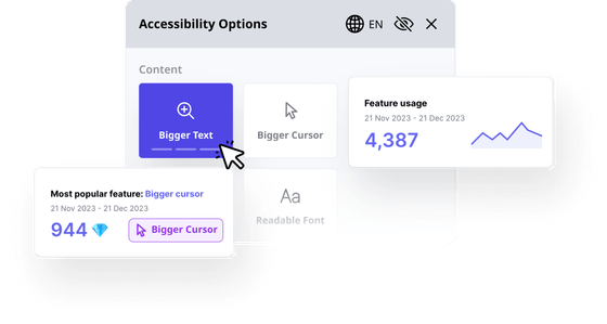
Accessibly offers several features that allow individuals with disabilities to better engage with websites and mobile applications. Some features available with the widget include, but are not limited to, adjusted reading lines, text-to-speech, larger cursors, larger text, grayscale, and the ability to modify text and background colors for a much higher contrast ratio, which is easier on the eyes for the visually impaired and color blind.
To get started on the road to WCAG 2.1, ADA, Section 508, and EN 301549 compliance, Accessibly is also offering a free 7-day trial. Feel free to test drive all the features before committing to a monthly subscription starting at $20 a month on Shopify and $25 a month on all other platforms.
Accessibly is compatible with the following platforms: Shopify, Squarespace, Weebly, Wix, BigCommerce, Joomla, WordPress, Magento, Elementor, WooCommerce, Drupal, Webflow, and Duda. You can also install it on any website using custom code.Avoid legal hassles and take the first steps to increase ADA and WCAG compliance with the Accessibly widget today!


