The Web Content Accessibility Guidelines (WCAG) are a set of universal guidelines created to help improve online web accessibility. WCAG is used internationally and should be understood by all web developers. WCAG has specific accessibility guidelines for color contrast on web pages. Color contrast refers to the contrast of color between the background and foreground content on a webpage.
If you are a developer concerned with creating accessible online content, it is essential for you to understand these guidelines. WCAG guidelines outline several success criteria for achieving quality color contrast on web pages. Understanding and referencing these specific guidelines is a great way to improve both web accessibility and user experience on your websites.
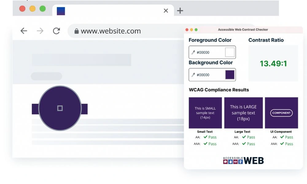
To check the contrast ratio of two colors using the Web Content Accessibility Guidelines (WCAG) 2.0 standards, you can use the following code snippet:

const checkContrast = (color1, color2) => {
  const c1 = color1.replace('#', '');
  const c2 = color2.replace('#', '');
  const r1 = parseInt(c1.substr(0, 2), 16);
  const g1 = parseInt(c1.substr(2, 2), 16);
  const b1 = parseInt(c1.substr(4, 2), 16);
  const r2 = parseInt(c2.substr(0, 2), 16);
  const g2 = parseInt(c2.substr(2, 2), 16);
  const b2 = parseInt(c2.substr(4, 2), 16);
  const l1 = 0.2126 * r1 + 0.7152 * g1 + 0.0722 * b1;
  const l2 = 0.2126 * r2 + 0.7152 * g2 + 0.0722 * b2;
  const contrast = l1 > l2 ? (l1 + 0.05) / (l2 + 0.05) : (l2 + 0.05) / (l1 + 0.05);

  return contrast;
}
The basics of color contrast accessibility
When increasing ADA compliance for your website, color contrast accessibility is one of the first steps you can take toward making your site easier to use for everyone. WCAG 2.0 guidelines provide specific contrast ratios for text and background colors to improve visually impaired accessibility. When these user interface components are built with sufficient contrast and accessibility in mind, it can bring a website up to legal standards.
Currently, websites are required to have a contrast ratio of at least 4.5:1, which puts them at level AA. To reach level AAA, user interface components must have a ratio of at least 7:1. To achieve this level, you will need to consider the active and inactive user interface components, foreground color choices, and even your images to ensure that your page is as accessible as possible.
What is color contrast accessibility?
Color contrast accessibility means that there is a difference in the ratio of brightness between the foreground and background color changes. For example, if you have a dark background, color combinations that feature dark text may be low contrast and challenging to read. That makes your user interface difficult to navigate for users with color blindness or low vision.
However, accessibility goes beyond using accessible colors. While this is important, other issues such as small text, difficult-to-read graphics, and complex backgrounds can all make a website more difficult to use. Clear graphical objects, a solid background, and bold text can all help clarify the meaning and navigation options for your website.
Why is color contrast important for accessibility?

Lack of color contrast means that your website may not meet web content accessibility guidelines, making it difficult or impossible for all users to access it. That limits the reach of your website and can impact its reputation.
Keep in mind that considering foreground and background colors, font weight, and significant other visual content is not just a matter of doing the right thing. It is also the law. If your website does not meet the guidelines set in the Americans with Disabilities Act (ADA), you could face legal penalties.
The impact of color contrast on different user groups
Color is a vital tool for accessibility in websites, visual presentations, and more. Meeting these contrast requirements can make a big difference in user interaction and how different groups engage with your website. For example, contrast may be vital for someone with color blindness, but enough contrast may not be the only feature that someone with low vision needs.
In these cases, you may need to consider font size, interactive elements, and more to ensure that your website is still accessible. However, color contrast can help all users see body text and images more in general easily. Because of this, even small changes can make a big difference for all users.
The Importance of Color Contrast For WCAG Compliance
There are several reasons why having color contrast that is WCAG compliant on your website is important. Having quality color contrast will improve the user experience for every user that visits your website. However, compliant color contrast will have a profound benefit to users with disabilities and impairments. Users with certain types of color blindness or similar conditions often experience low contrast in their vision. This can make seeing content on web pages challenging, especially when content has poor color contrast.
Differentiating colors can be more difficult for users with visual impairments. This includes online features such as edges and borders. This is why it is important for developers to ensure their websites include high-quality color contrast. Website designs and content that fail to meet the minimum color contrast requirements provided by WCAG must be avoided. Content that falls below this threshold will likely be unviewable for many users and creates an inaccessible online environment.

Guidelines and best practices for achieving optimal color contrast
To ensure that normal text and other foreground and background elements have a strong color difference, you may need to ensure you are taking the right steps to achieve optimal color contrast. A different color combination can have major effects on the visual content of your page, so choosing great color pairs makes a big difference. So what can you expect when working towards these best practices?
WCAG guidelines and requirements on background colors and color contrast
When following the WCAG guidelines on background color, it is important to understand what the guidelines necessitate. Generally, the guidelines are meant to provide guidance on the contrast requirement needed to make text readable for someone with moderately low vision, severe low vision, or color blindness. If contrast is not high enough, even large text or large-scale text may be unreadable in lower contrast spaces.
Accessible color combinations and tools for testing contrast
Generally, your color scheme should include at least some higher contrast colors between your text and background elements. The success criterion for this is the ratio of brightness between the elements. This is vital for conveying information on your website.
To ensure that you have chosen a good color contrast that meets contrast requirements, you can check the color contrast by using a contrast checker. This can determine whether your page meets the minimum level to pass the requirements. This can be a trial-and-error situation, but it can make a big difference in the usability of your page.
Strategies for achieving and maintaining proper color contrast ratios
Choosing the right color spaces is a vital part of maintaining proper color contrast ratios, which must be at least at a level AA per the WCAG guidelines. Generally, using colors with bold differences can maintain this contrast. However, there are other tools you can use for maintaining your color contrast ratios.
For example, being able to better identify a good contrast ratio can help. Use a color picker to choose a few of the colors used on your site and put them through a contrast checker. Seeing the difference in background and text color can help you better understand this difference and stay mindful of what makes a good color contrast.
Common challenges and misconceptions
One of the bigger misconceptions about color contrast and accessibility is that incidental text or text that is purely decorative should not be a concern for accessibility. However, unreadable text or graphics that are hard to decipher can confuse your users, especially if there are no accessibility features to help them identify those elements. That can impact whether you are meeting the success criteria outlined in the WCAG guidelines.
Good Contrast
Color contrast describes the perceived difference in brightness between two colors. In order to measure the contrast between two colors, the difference in brightness is expressed as a ratio. The ratio of two colors can range from 1:1 to 21:1. A ratio of 1:1 would be used the describe the same color twice, while 21:1 would describe opposite colors (such as black and white). There are multiple success criteria for contrast described in WCAG guidelines.
The first is the minimum contrast ratio. The level AA minimum contrast requirement is a contrast ratio of at least 4.5:1. There are several exceptions to this rule, including large text and company logos. However, it is always best to seek a ratio of at least 4.5:1. It is also important to note that this is a minimum requirement under WCAG guidelines. Text with a 4.5:1 ratio will often still be challenging to read for many users.
The level AAA success criterion is known as enhanced contrast. This follows the same structure as the level AA success criterion but instead requires a more strict 7:1 ratio for normal text and 4.5:1 for large text. This higher level of contrast is recommended by the WCAG, but still higher than the minimum requirement.
Bad Contrast
Bad contrast could be used to describe any text or website feature that falls below the 4.5:1 ratio threshold outlined by the WCAG level AA success criterion. Not only would this content fail to meet the minimum requirements outlined in the WCAG, but it would also be inaccessible to most users. By understanding the WCAG guidelines, developers can avoid bad color contrast fairly easily.

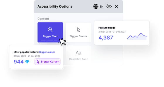
How Accessibly’s services can assist in improving color contrast accessibility
Whether you need tools for larger text, using logotypes text, keyboard focus, and more, the team at Accessibly is here to help. We can help websites stay compliant with legal statutes and provide equity across the internet. Our tools can help users better navigate your website and use it to its fullest potential.
Real-life examples and success stories
Our accessibility features are not just a theory. Many websites have major success stories about the ways these tools have helped improve their website.
Case studies showcasing the impact of improved color contrast
Every day, different companies show the difference color contrast can make. For example, while HubSpot may not have had accessibility in mind, A/B testing of green buttons against red buttons, which had a higher contrast, showed a 21 percent increase in clicks with the red button. Color can have a big effect, not just on psychology, but on accessibility.
At Accessibly, we are committed to making the web a more accessible place. If you are ready to make that commitment for your website, we are here to help you succeed. To learn more about your options, start our 7-day free trial – no credit card required.