Font sizes are an essential element to consider if you are building a website. It is also important to consider how the fonts you select will affect the accessibility of your website. Ensuring the fonts presented on a webpage are ADA-compliant is a great way to improve user satisfaction and accessibility. However, it is not apparent which fonts are the best for web accessibility or what rules you should follow regarding fonts when you are building a website. There are a few guidelines developers can follow to ensure they are using fonts on their websites that are both accessible and ADA-compliant.
/* <relative-size> values */
font-size: smaller;
font-size: larger;

/* <length> values */
font-size: 12px;
font-size: 0.8em;

/* <percentage> values */
font-size: 80%;

OR
<p>
  <span style="font-size: 12pt">This text is 12pt</span><br>
  <span style="font-size: 14pt">This text is 14pt</span><br>
  <span style="font-size: 16pt">This text is 16pt</span><br>
  <span style="font-size: 18pt">This text is 18pt</span><br>
</p>
What is accessibility font size?
When designing and building your website, you want to be sure it is accessible for visually impaired users. Those with low vision may need specific changes to font size to read the information on your site. Small text, especially for footer text or legal text, may be especially difficult to read, and adjustable font size can help with this.
Making font sizes accessible is not just about making your font larger. While keeping your fonts between 12 to 14 px can help make your page easier to read, standard accessibility guidelines suggest using relative font sizes. Accessibility in font size means more users can access your site, keeping you both within legal guidelines and helping improve equality across the internet.
The Importance of Accessible Fonts
Accessible fonts are a fundamental component of creating accessible online environments. Because text is one of the primary ways information is communicated online, it is essential to ensure the text is accessible to all users who access it. At first, fonts may seem like a trivial component of website design. However, for users with visual disabilities or impairments, fonts have a significant impact on their ability to perceive and access online information. This includes considerations such as letter spacing, font types, and color contrast to ensure readability for people with low vision.Normal text should meet minimum size requirements and avoid using images of text where possible, as these can be problematic for screen readers and those with visual impairments. Ensuring web accessibility means paying attention to every visual element on the page. Fonts should also adhere to the Web Content Accessibility Guidelines (WCAG) to be resized without assistive technology and maintain clarity and readability. Proper color contrast between text and background is crucial to meet the contrast requirement and aid people with low vision in accessing the content. If developers fail to design websites with accessible fonts and proper color contrast, the information presented may be inaccessible to some or all users. It is equally important to convey information and functionality through accessible design choices, allowing for a better user experience for everyone.
When determining if a font is accessible or not, there are a few key concerns to consider. The first is font size. If font sizes are too small, users with visual disabilities or impairments will have difficulty reading the text. The other key feature to consider when developing a website is the font’s ability to be expanded. WCAG Guidelines recommend that text can be zoomed to 200%. WCAG also recommends implementing liquid layouts designed to accommodate 200% text. Allowing text to be expanded to 200% provides additional accessibility capabilities for users that have an especially difficult time viewing online web content. It is also necessary to ensure that when text is expanded, it does not lose its content or functionality. The specific success criteria for an expandable font are described by WCAG Guideline 1.4.4. Developers should become familiar with these guidelines when selecting the font for their website to ensure the content is compliant and accessible.
/* Font size for Accessiblyapp */
<p>
  <span style="font-size: 12pt">This text is 12pt</span><br>
  <span style="font-size: 14pt">This text is 14pt</span><br>
  <span style="font-size: 16pt">This text is 16pt</span><br>
  <span style="font-size: 18pt">This text is 18pt</span><br>
</p>
Why is accessible font size crucial for website usability?
For those with low vision, being able to resize the font or simply having the font in an accessible size is a vital part of making a website usable. Simply put, if a low-vision user is unable to read or adjust the font size, they may have to leave your website. That can leave you facing complaints from users and even lead to legal trouble if your website is not ADA-compliant.
Many web users also use a screen reader to help them navigate the web. However, if there is an issue with the screen reader or if the screen reader cannot read the text, making sure that the fonts are accessible allows low-vision users a method to be able to access your site. That means those users will not have to leave the site.
How does Accessibly help improve accessibility font size?
Ensuring that you have accessibility in font size can be tough, but the tools Accessibly offers can help. The correct text spacing and sizing can make a big difference, which our site helps provide. If you suspect that your font size is a problem, our team can provide guidance and tools to fix this.
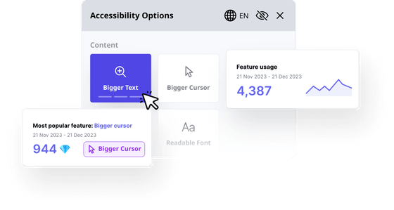
One of our features is a widget specifically to increase text size on your website. This widget creates an option for users to select from multiple font sizes so that all users can improve readability for themselves. That means users with visual impairments will not be left out from using your site.
Methods for adjusting font size for different devices and users
One of the most important requirements for font size adjustments is to be able to adjust the font size to 200 percent of the original size. However, it can be difficult to set this up on all devices and users. After all, some people may use their laptop, a desktop, a phone, or other devices to access the internet.
One of the easiest methods for adjusting font size is to use relative units. Typically, this is done by using percentages to set type size rather than absolute numbers. Other options may be available to you depending on the editor you are using, and you can always rely on Accessibly’s features and widgets to make web accessibility a breeze.
Importance of considering font size in web design and development
As you design your website, it is crucial not to forget to consider font size as you build it. Web design is all about guiding where a user’s attention goes. That makes it easier for users to get the information they need from the website as easily as possible.
To make navigation easier for users, it is important to consider all the elements of your website. Font size is part of this, as smaller font sizes may make your website more difficult to navigate, but color and background elements can also impact how visible the font is. Considering all these options in tandem can help make your website as usable as possible.
Minimum Font Size for Accessibility
In general, 12pt (16px) font is often recommended as the minimum font size for the body text of a website to be accessible. Text any smaller than this may be illegible on many platforms, which can create additional accessibility issues. However, this ultimately depends on your target audience.
When developing a website, you should always avoid using a font size of 9pt (12px) or smaller. 9pt text is difficult to read for the majority of users and will likely be inaccessible to any viewers with visual disabilities or impairments.
For accessibility purposes, it is recommended and considered best practice to use relative font sizes on websites. Using absolute text sizes can make it challenging address accessibility because the text may not be resized appropriately across multiple platforms. For this reason, it is recommended to use other methods such as percentages or units of em.

Best Accessible Fonts
When deciding which font to use for your website, there are a few elements you can consider to determine if a font is accessible or not. In general, the most accessible fonts for websites are fonts in the sans-serif family. Luckily, the sans serif font family includes a large array of options, giving developers creative freedom for their website designs. Arial, Helvetica, Open Sans, Tahoma, and Verdana are some examples of commonly used fonts that are in the sans serif family and sufficiently accessible for all users. It is best to use fonts that are commonly used and widely available. This ensures the font is not confusing or distracting for users.

Additionally, the Accessibly widget includes several features that can help address the accessibility of website fonts. Accessibly has the ability to increase the size of site text up to 200% and increase line height if needed. This can be quite helpful for users visiting sites that have failed to use accessible fonts. Finally, Accessibly also has a feature that can change the site font to Helvetica, one of the recommended readable fonts.
Other accessibility considerations for a user-friendly website
Accessibility does not begin and end with font sizes. For example, low-vision users may have difficulties if colors do not contrast enough, if backgrounds are too busy, or if they have difficulty navigating using their screen readers. Ensuring compliance with web content accessibility guidelines and meeting the official minimum font size for body text are crucial steps toward enhancing a website’s accessibility. Accessibly strives to give designers and developers the creative freedom they need while ensuring that the website is usable for everyone. Utilizing an accessibility checker helps maintain accessibility standards across multiple devices and user preferences. By focusing on web accessibility, including appropriate contrast ratio and ensuring that text elements in website text are easily readable, the overall user experience improves for everyone, including those using assistive technology.
Accessibly is an accessibility leader in web spaces, helping web designers, developers, or website owners build beautiful, high-performing websites that meet the accessibility standards for all internet users. If you are building a website and need help making your font sizes as accessible as possible, do not hesitate to reach out to us. Our team can tell you more about our apps and features when you call us or fill out our online contact form.